New User Interface: Coming Soon!
about 2 years ago
Hello everyone!
Get ready - the new KARDS user interface is just around the corner! Here, we’ll go over the timeline of the release of the new UI to PC and provide an overview of what these changes entail.
When is the New User Interface Available?
The New UI will become available for all players in the latter half of March.
Prior to the full release, we will have a short test period for the new UI, starting in the beginning of March. Players on Steam will be able to access a public test branch with the new UI. We will provide specific details on how to join the public test and how to give feedback when we are closer to the actual test in early March.
New User Interface: Overview
From our own insight, community feedback, and the ambition to run KARDS for many years to come, we’ve seen that the KARDS user interface could be improved. In developing the mobile version of the game, we saw an opportunity to overhaul the user interface, to streamline it and improve the overall user experience. The new user interface will be available on both the PC and mobile version of the game, so players will have a consistent experience regardless of which device they are playing on. Here, we’ll give a brief overview of what you can expect with the new UI. For more details, you can refer to the dev blogs written by our Chief Creative Officer Gummi: New User Interface: Part I - KARDS Home Screen, New User Interface: Part II - Play, and New User Interface: Part III - Cards.
KARDS Home Screen
The KARDS home screen is changing fundamentally with the new UI. The KARDS Home Screen has a new look, allowing for increased flexibility and for us to communicate better about all the exciting things going on in and around KARDS.
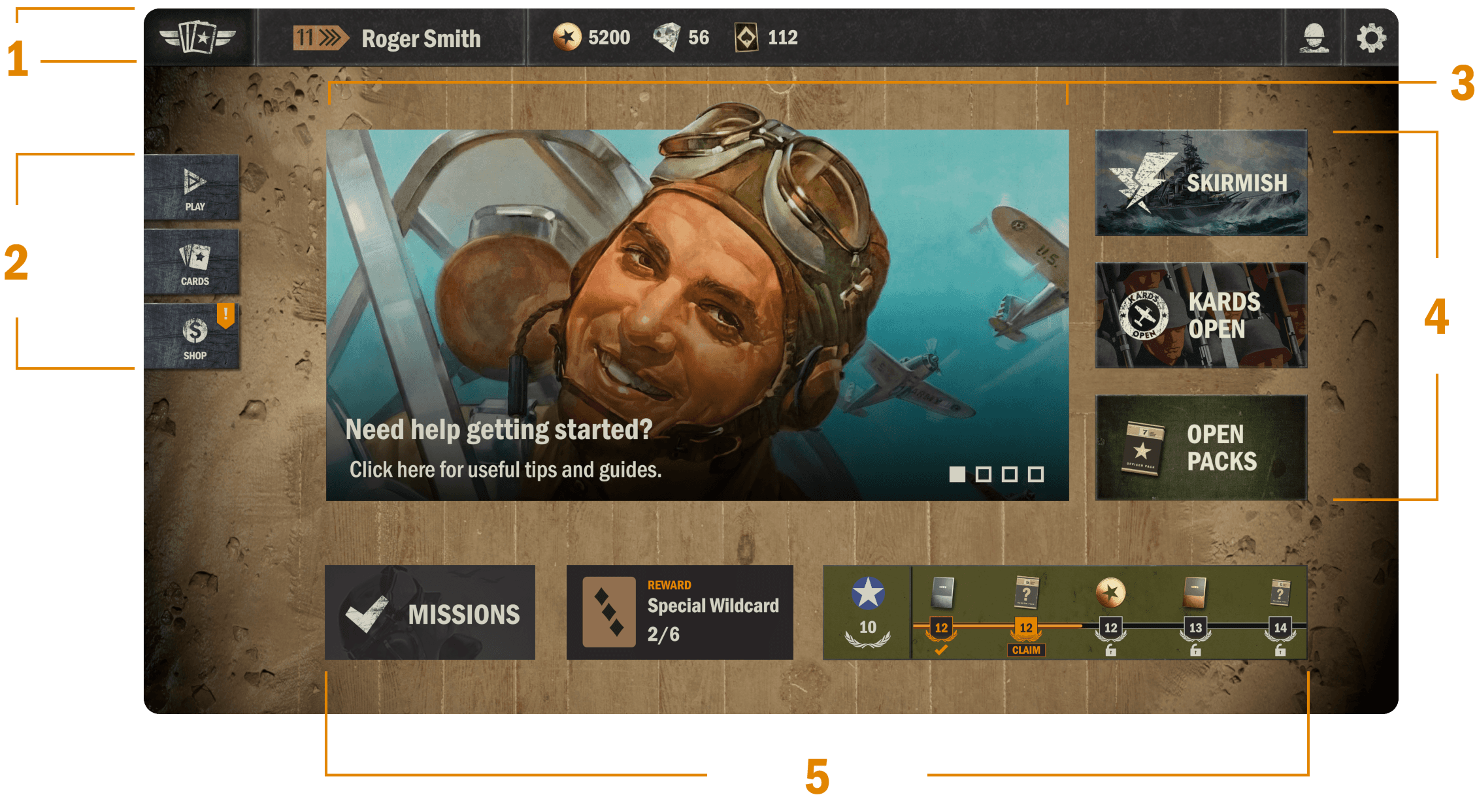
1. The Top Bar
On the far left, you’ll find the Home button. Simply click or tap the KARDS logo to take you back to the home screen from almost any other part of the UI.
Next is the button to your profile - indicated by your current rank and player name.
Then, the resource overview - the amount of gold, diamonds and wildcards you have.
Finally, on the far right, you have the Friends and Settings buttons.
2. The Main Menu
PLAY navigates to Battle, Training, Campaigns, or any other game mode. More on this below.
CARDS gets you to your decks, deck builder and card collection. More on this below.
SHOP takes you to the shop.
3. Content Carousel
The content carousel is a rotating banner on the home screen that keeps you updated on all the latest things in KARDS. This can be information about a recent expansion, decklists, guides, dev blogs, news, store offers, tournament info, etc.
4. The Right Side Buttons
The buttons on the right side will vary depending on the content we want to highlight or feature at any given time. They will mostly be reserved for shortcuts to specific events or game modes, such as Skirmishes.
5. The Progress Line
On the bottom of the new UI you will find your national progress - the UI will by default show you the last main nation you progressed in, but you can also switch to a different nation. You can also access your missions here.
PLAY Button
The Play button determines how you enter any given game mode.
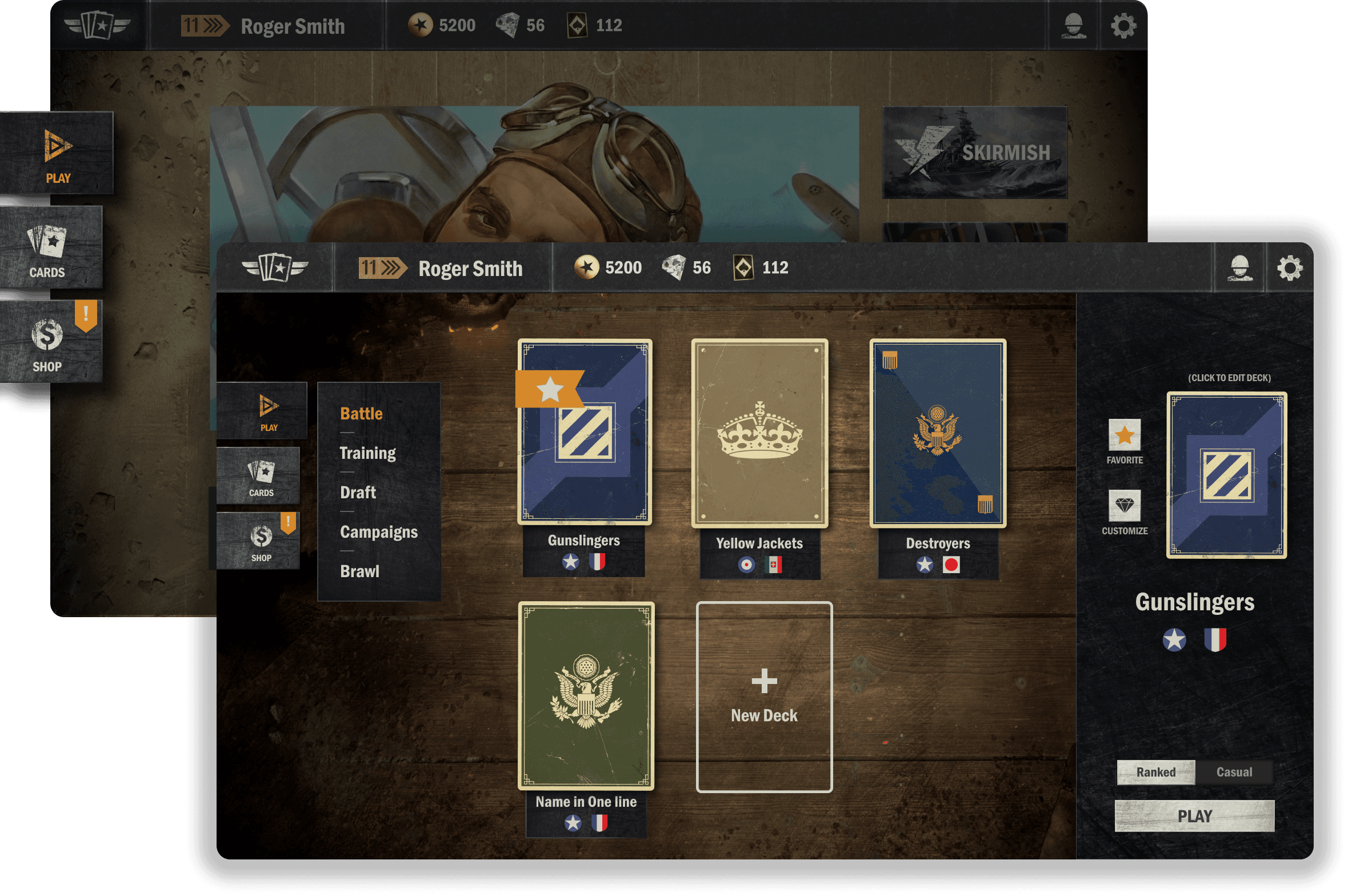
Under the Play options, you’ll be able to select any of the game modes available at the time:
Battle (PvP) - with a toggle between Ranked or Casual
Training (PvE)
Draft
Campaigns - starter campaigns or Theaters of War
Skirmish - when available
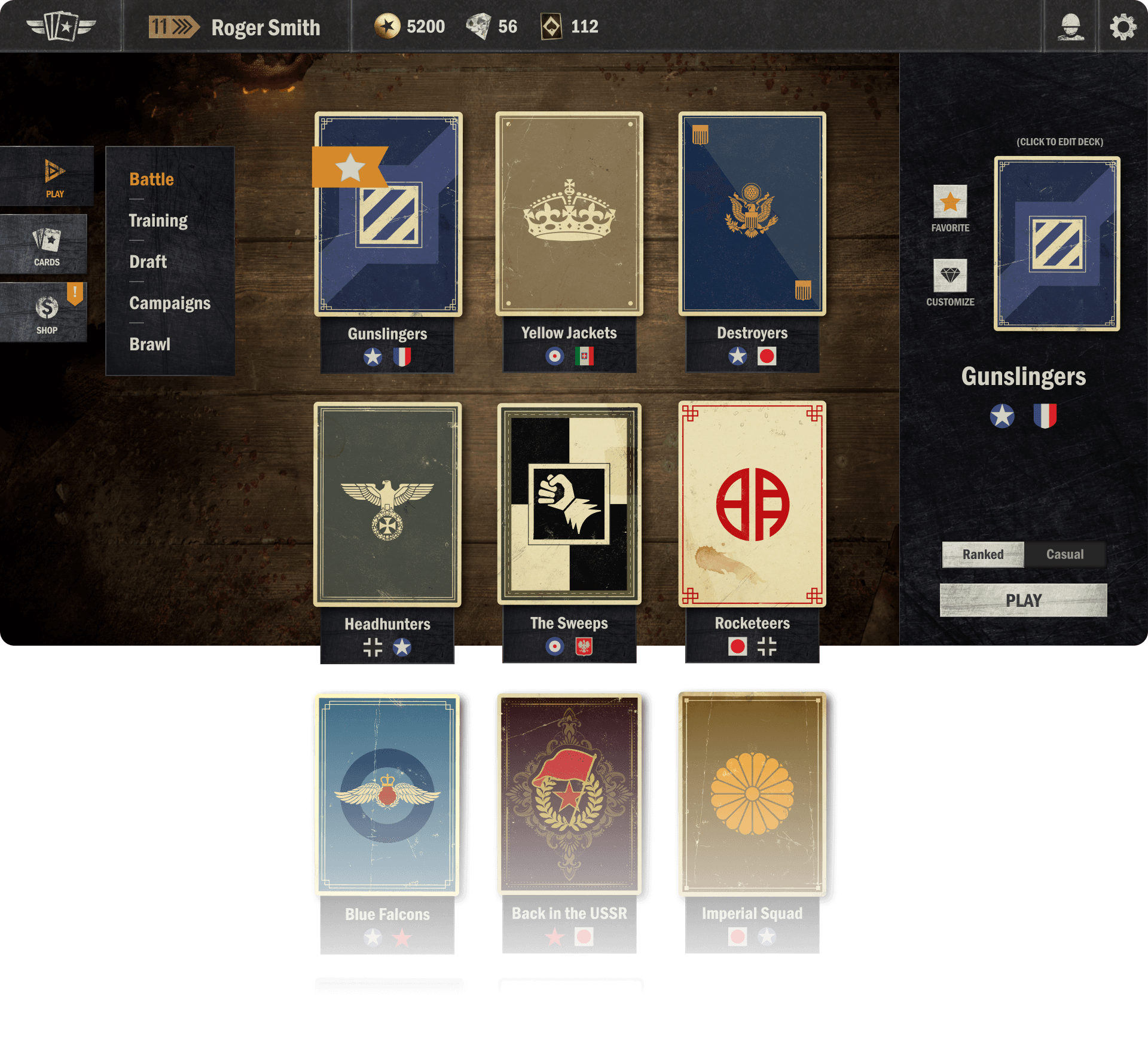
Select Deck
After picking a game mode to enter, you’ll be prompted to select a deck from your library to play with. Scroll or swipe up and down to browse your list of decks. Decks will be ordered by usage (last played, last created, etc.).
On the right hand side, you’ll see the selected deck and interact with it through the buttons provided. Customize the deck (swap card-back, HQ, board items or emotes), or hit the star button to favorite the deck, so it’ll always show up at the top of the deck list.
Below the selected deck, you’ll be able to toggle between ranked or casual mode, and, finally, hit the play button to head into the game!
CARDS Button
The CARDS button on the main menu brings you to the new interface where you can explore your decks and collection of cards.
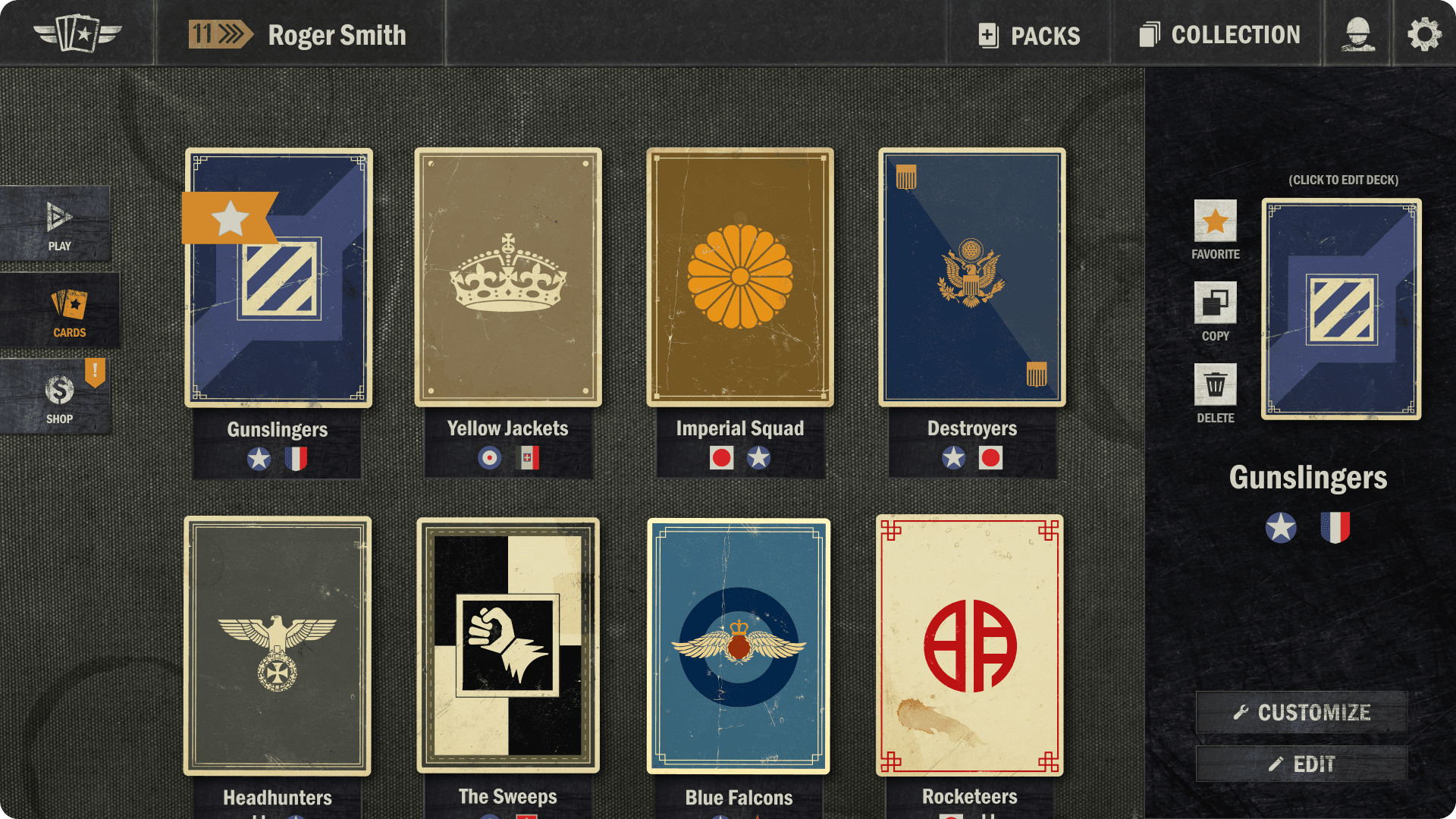
Click or tap the PACKS button on the Top Bar to open your unopened packs.
Click or tap the COLLECTION button on the Top Bar to access your card collection.
Browse through your library of decks by scrolling or swiping up and down.
Click or tap the empty deck slot to create a new deck.
Click or tap any of your existing decks to bring up details about the deck and edit it.
Mark the deck as a favorite, copy the deck code to your clipboard, delete the deck, customize deck elements, or edit the deck.
Deck Builder
The layout of the deck builder has changed quite significantly. These changes are done with consideration of a lot of community feedback we’ve received throughout the years. The goal with the new deck builder is to improve accessibility, provide an improved deck overview, have a consistent and clear UI for the upcoming mobile version of the game, as well as introducing various improvements for power users (especially on desktop). The new deck builder is split into three main areas:
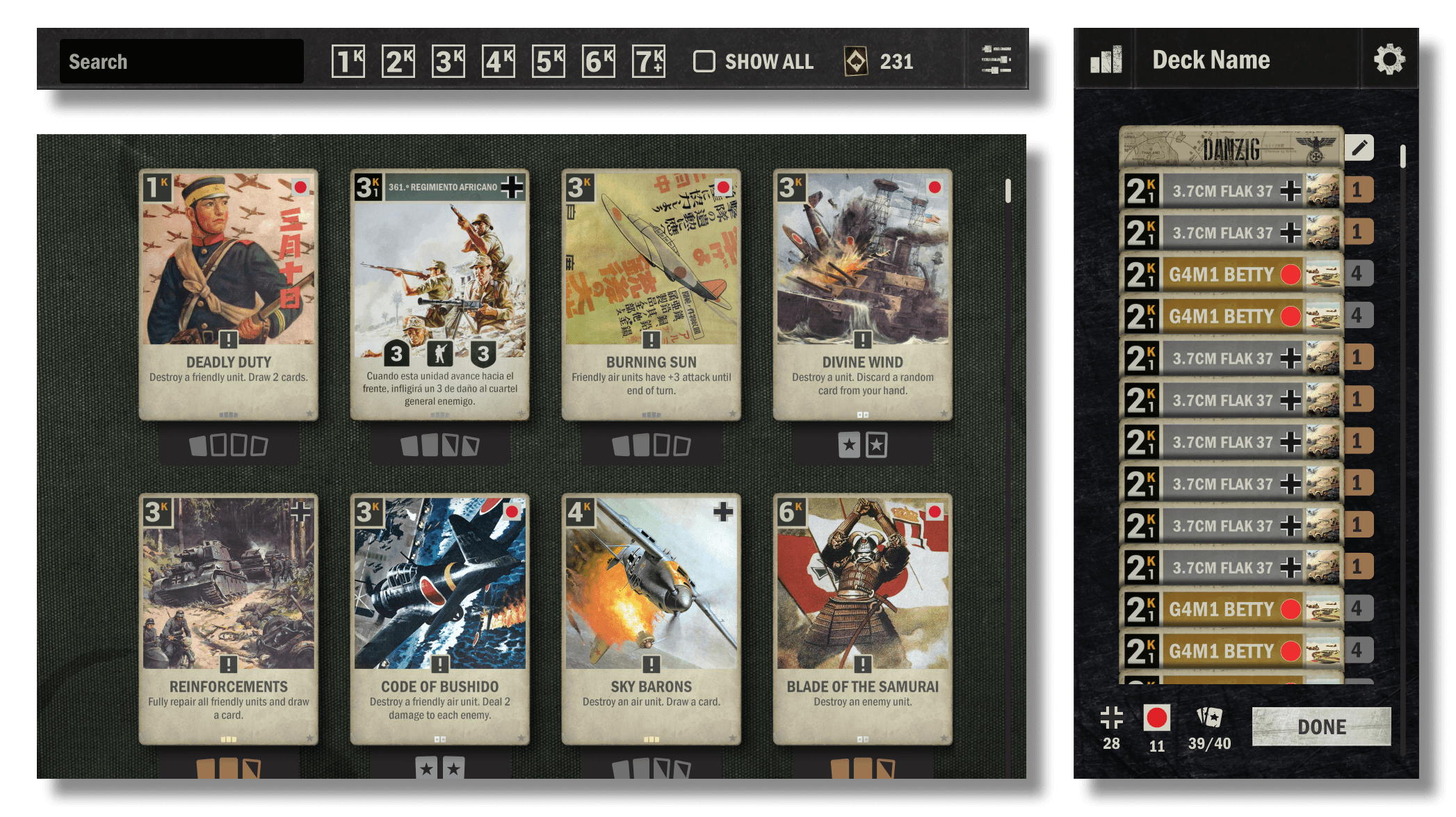
The Top Bar, where you can click to “show all” (including unowned cards), with a search bar, a wildcard overview, and a button to access filters.
The Card Collection, filtered by the nations in the deck. Scroll or swipe up and down to view all the cards. Click or tap a card for more details and the ability to create a card with wildcards.
The Deck Overview is visible in its own panel on the right side. Here, you can have a convenient overview of the cards in your deck, access more details about the deck, change the name of the deck, and edit the HQ/battlefield.
That covers the main points of the new UI changes. As a work in progress, there may still be some adjustments to the elements outlined above.
As previously mentioned in this blog, we will do a short test with the new UI in early March. This test will be accessible to Steam users through a public test branch. We aim to release the new UI to all PC users in the latter half of March. We’ll update you on the specifics of the test as we get closer to the test time. Keep an eye out for new dev blogs, join us on Discord and follow us on social media to make sure you don’t miss a thing!
